Copyright © 2020-2026 Traco Systems a.s.
version 2026.4.0
Cloud UX | Octopus | User Guide
This guide provides instructions for using the Cloud UX | Octopus application to work with Octopus Newsroom stories and rundowns.
Table of Contents
- Introduction
- Cloud UX | Octopus Interface
- Octopus App in Embedded mode (Media Composer, Adobe Premiere Pro)
- Integration with Traco GFX
- Integration with Other Systems
Preface
Octopus is the name of your computerised newsroom system, which will connect everybody in the newsroom, regardless of their role or location. Octopus will benefit each of you in different ways, depending on your job, but it is essential for everyone to understand the basics of its working.
This is an essential guide for Octopus app in MediaCentral | Cloud UX, with the basic information about how to log on and off, and how to use the system.
Octopus and Cloud UX at your organization may be configured differently than shown in this manual. Menu options will vary according to modules used by your organization, story folders will have different names and rundowns may be organised in a different way. Ask your system administrator if you think something is missing or configuration changes are required.
Introduction
How to Access Cloud UX | Octopus
Every user needs their own specific login name and a password to access Cloud UX. After signing in, each user can open the Octopus application from the Cloud UX applications menu bar, but the content and the user roles are dependent upon the system configurations. If some content is missing from Octopus or additional content is displayed which is not in the regular Octopus application, please contact system administrators.
Dock Application
Octopus application allows the users to open the app in docked mode by clicking the dock button or by drag and dropping the Octopus icon from the applications menu to the left area of the Cloud UX window.
Cloud UX | Octopus Interface
Opening the application for the first time will display the Rundowns or the Story Folders List with predefined filters applied.
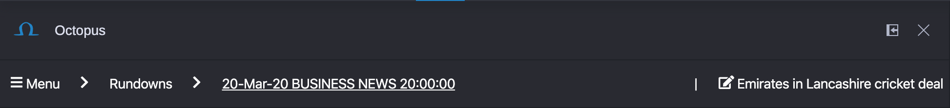
In the header of the Octopus application a menu bar is always shown for easier in-app navigation. Octopus menu bar always displays the currently opened Octopus objects, like the rundowns or story folders list, the currently opened rundown or story folder and the currently opened story for editing. Views can be opened by clicking on these buttons in the Octopus application's header.
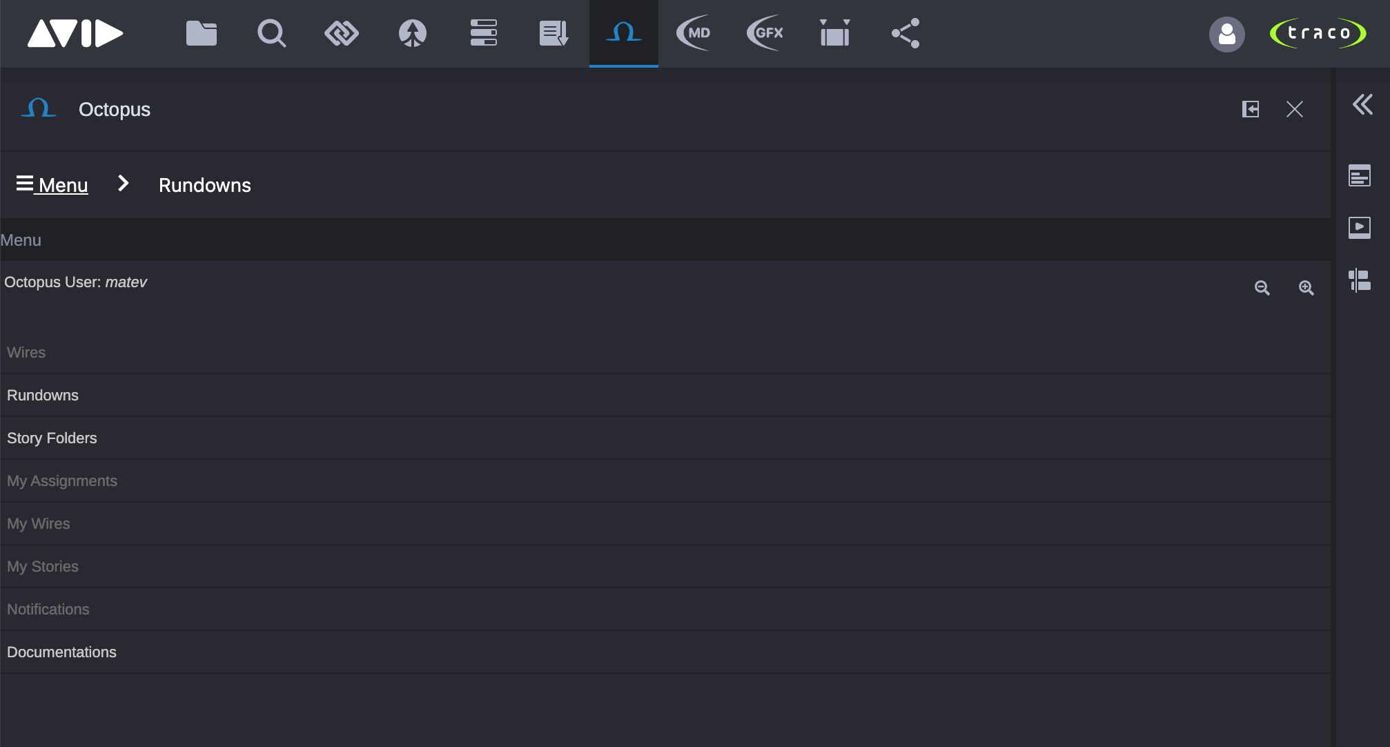
Main Menu
Clicking the Menu button in the header will show the root Octopus objects which can be browsed. Some of these can be grayed out which means that they are not configured with the system. To enable the disabled objects please contact system administrators.
Changing Default Text Size
In the upper right corner of the Menu page, users can find buttons for increasing and decreasing font size in the Octopus app. The changes will be automatically saved to user settings and will be available next time when a user logs in. Changing the font size has effect for the majority of the Octopus app's components, however some buttons and components may keep their original size.
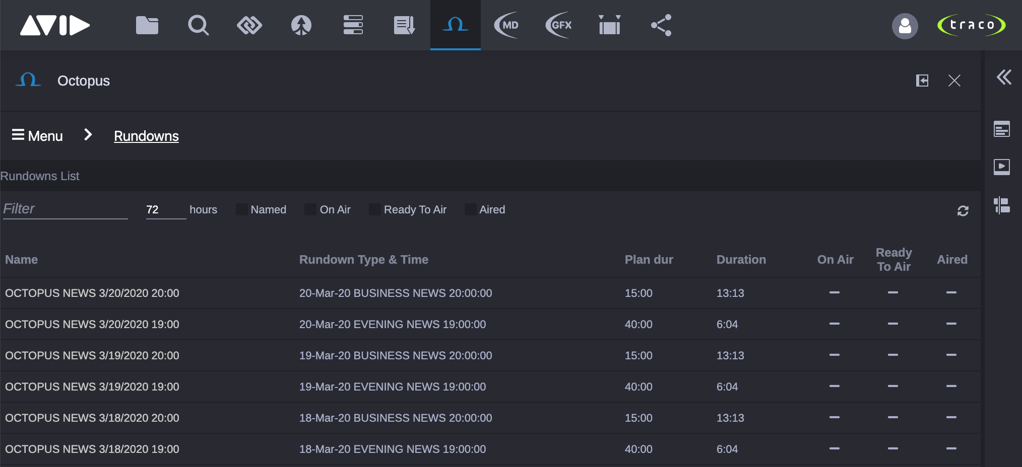
Rundowns List
Clicking the Rundowns button in the Menu will open the Rundowns List.
Toolbar
In the toolbar predefined search filters can be changed for displaying only the necessary rundowns.
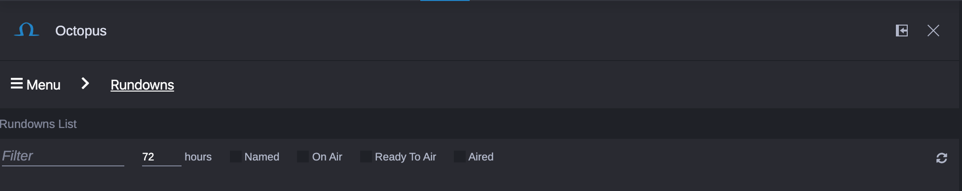
- Filter: Simple text filter.
- hours: This value is defining the search interval, e.g. if set to 24, then rundowns +- 24 hours from the actual datetime will be displayed (this field is automatically disabled when the Named filter is active).
- Named: If enabled, then all named and scheduled rundowns are displayed (automatically disables time filter if activated).
- On Air
- Ready To Air
- Aired
Changing these filters will automatically save the actual filters to the user's settings and will be automatically re-applied when the user opens the application in the future. Even from other computer.
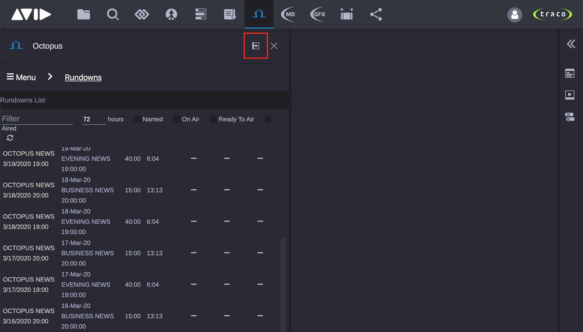
On the right side of the toolbar a refresh button is located for manually refreshing the rundowns, because the Rundowns List is not updating automatically.
Open Rundown
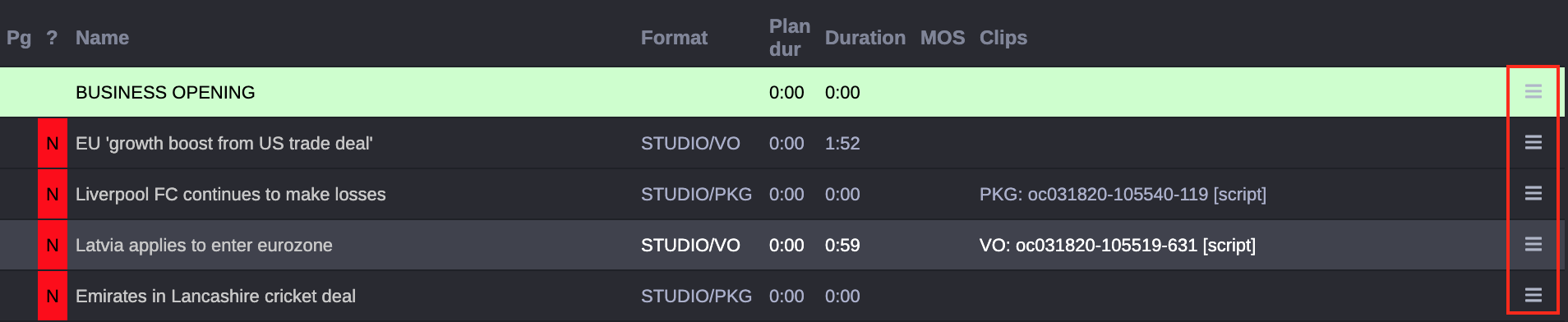
Clicking a rundown in the Rundowns List will open the rundown and switch the view to display its stories.
Rundown's stories
The visual of the rundown view will correspond and respect all colors which are used in the regular Octopus application. This view is automatically refreshed every 10 seconds, but executing a manual refresh is also possible from the view's toolbar.
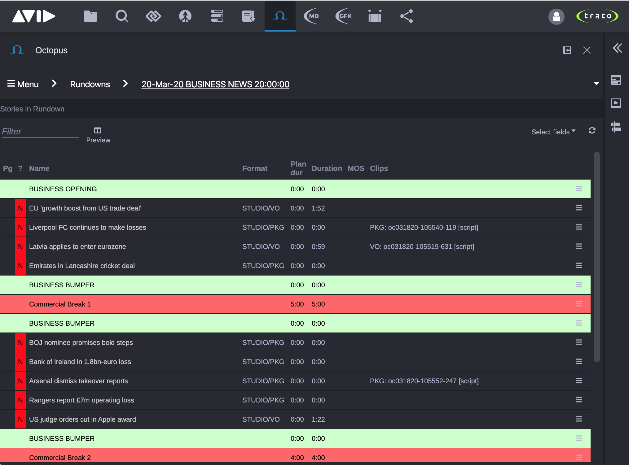
Toolbar
In the toolbar the users can apply filters and customize the Rundown view.
- Filter: Simple text filter.
- Preview: Enable/Disable rundown preview mode (if enabled, then the opened story editor will be displayed right next to the stories list).
- Select fields: Choose which columns are displayed for the stories.
Changing the displayed fields automatically saves the changes to the user's settings and will be automatically re-applied when the user opens the application in the future. Even from other computer.
On the right side of the toolbar a refresh button is located for manually refreshing the stories list, however they are updated every 10 seconds automatically.
Story Actions
Users can trigger several actions for each story in the stories list by clicking their "action button" in the last column.
Open Story
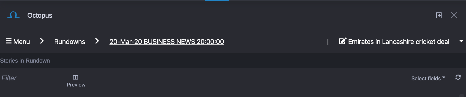
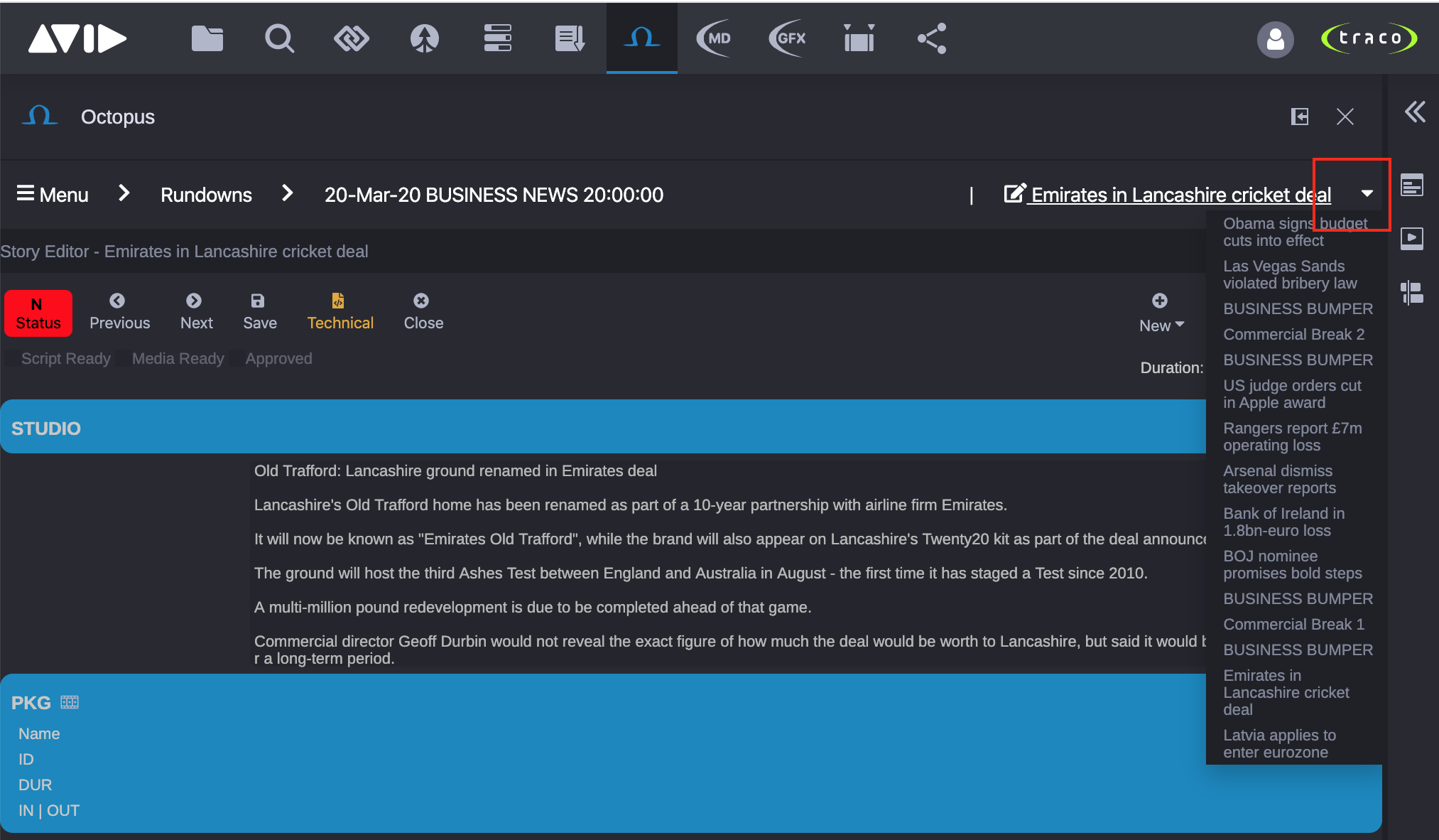
Clicking a story in the rundown will open the story and switch the view to display the story editor.
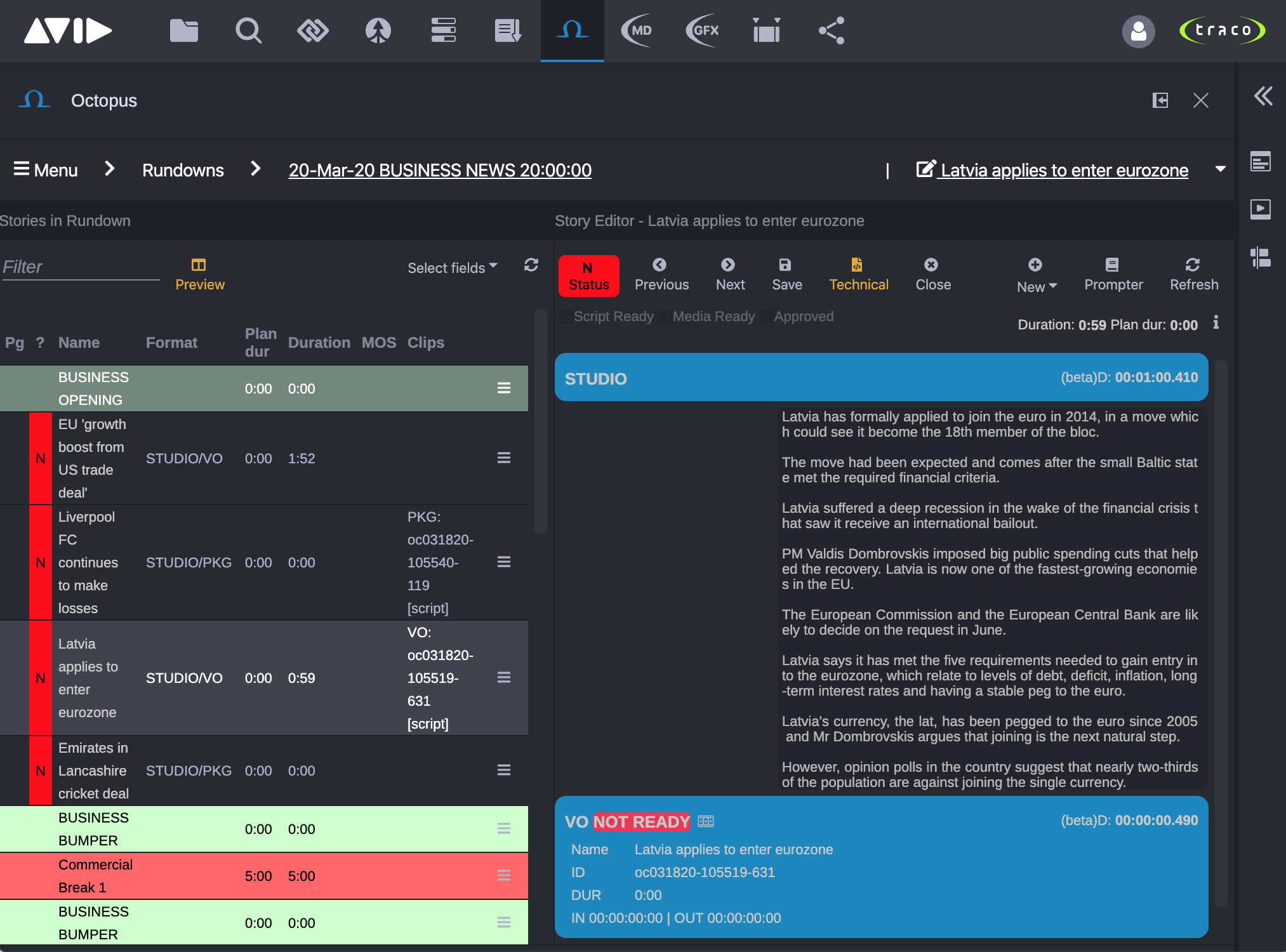
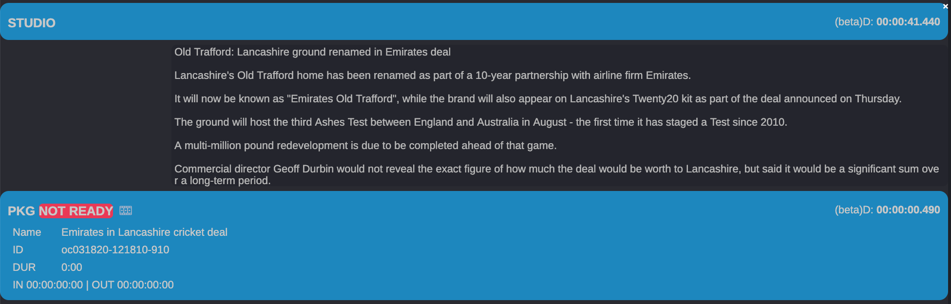
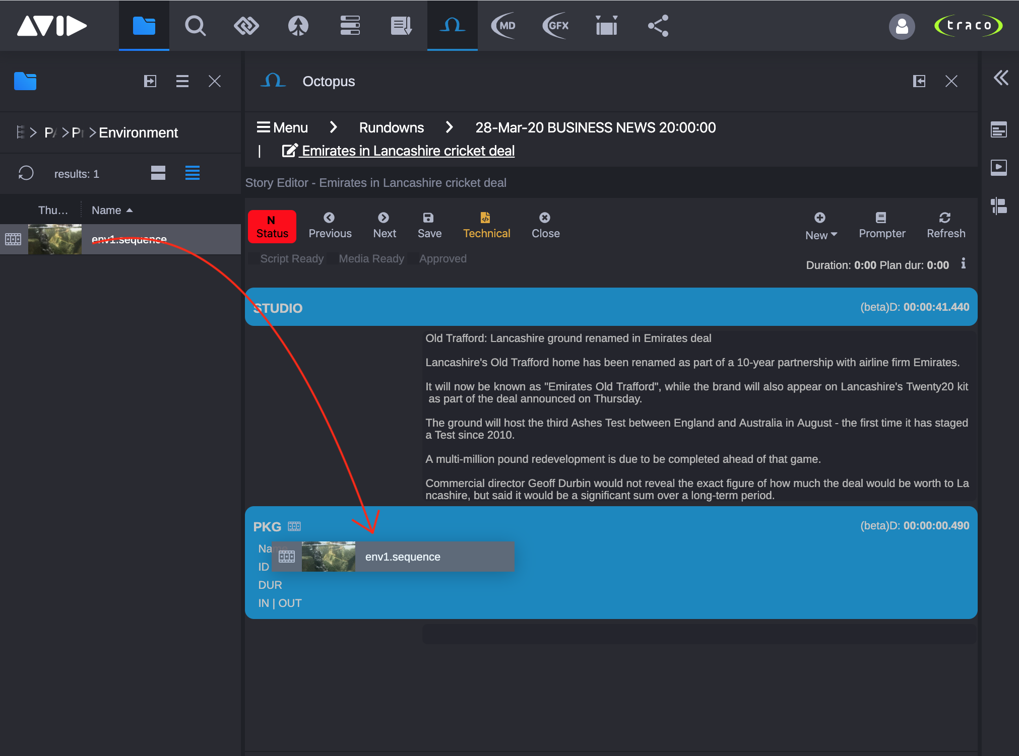
Story Editor
The visual of the story editor view will partially correspond and respect the majority of colors and formats which are used in the regular Octopus application, however some elements may not exactly match.
Story Locks and Conflicts
In the current version of the application is not possible to lock the story from the Cloud UX interface, so be aware that other users can open and modify the story from other Cloud UX window or even from the regular Octopus application. If other users change the story which is opened in the Cloud UX, then an error message will be displayed in the story editor and the user will be unable to save his/her modifications.
We recommend copying the user's modifications to a text file, refreshing the story (what discards all local modifications) and contacting the user who made the modifications to the same story. After resolving the conflicts with the user who made the changes from other computer, user can paste back the changes which were saved to text file in previous steps and save the story modifications.
In case the same story was edited at the same time (or within a few seconds) by different users, then the last save operation will determine the content of the story.
Opened Stories History
If the user had multiple stories opened in the Cloud UX session, then the last 15 stories can be re-opened.
Toolbar
In the toolbar, users can find the most important actions and options which are necessary for daily work.
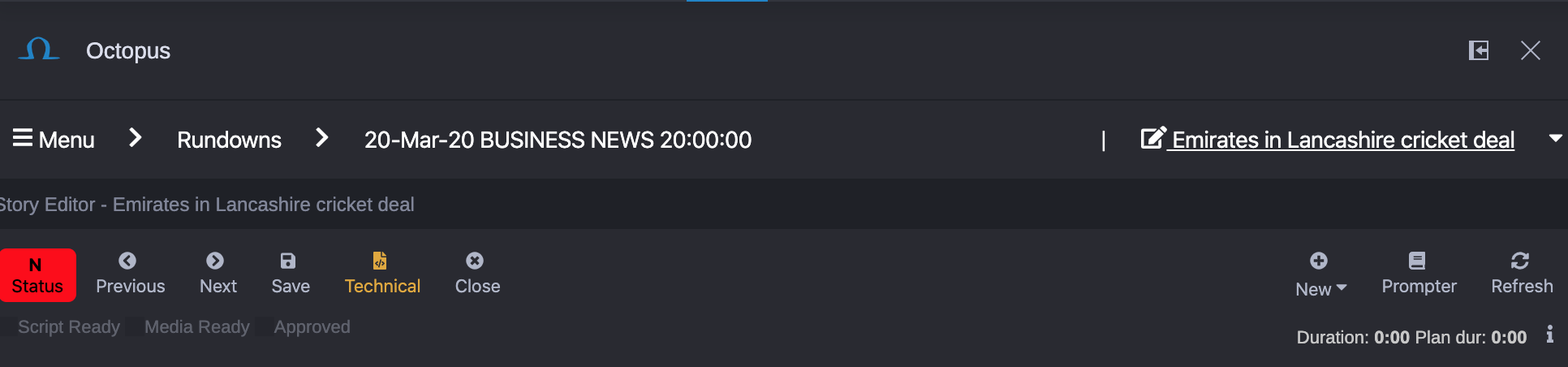
- Story Status Color: Visualization of the story status color is inherited from the regular Octopus app. Directly below this are checkboxes for changing the story status. ⚠️ Important: After changing the story status, the story status color will be updated only after saving the story.
- Previous: Open previous story in the rundown (available only if the story was opened from a Rundown).
- Next: Open next story in the rundown (available only if the story was opened from a Rundown).
- Save: Save the story.
- Technical: Enabling/Disabling technical view (displaying story object details).
- Close: Closing the story (if there are unsaved changes in the story, then a popup will appear to notify the user to save the story before closing, otherwise the changes will be discarded).
- New: Adding new story element to the story.
- Prompter: Enhanced view mode for better story reading, controlling or easier voiceover recording.
- Refresh: Refreshing the story (if there are unsaved changes in the story, then a popup will appear to notify the user to save the story before refreshing, otherwise the changes will be discarded).
- Durations: Displaying the actual and the planned duration of the story.
- i: Button for displaying additional information about the story.
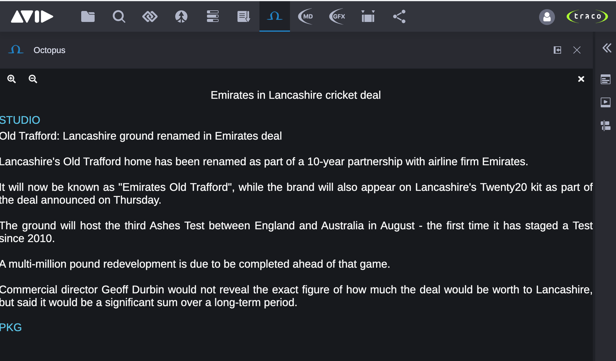
Editing a Story
Clicking in the text editor the user can change the story's text or also other story script elements like Notes and MOS Objects. After the user finished editing the story, it is necessary to manually save the story with the Save button. Keep in mind that signed in user needs to have the appropriate rights to save the changes. These user rights are defined by Octopus administrators.
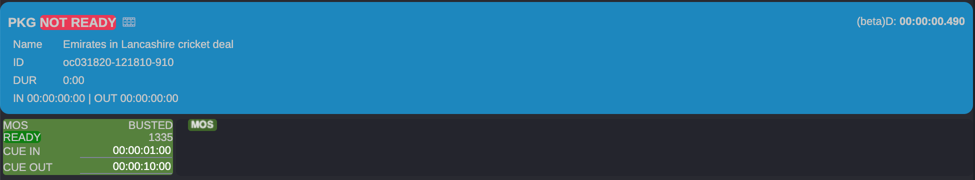
Editing MOS Objects
Users can edit MOS Object details, like the CUE IN and CUE OUT timecodes.
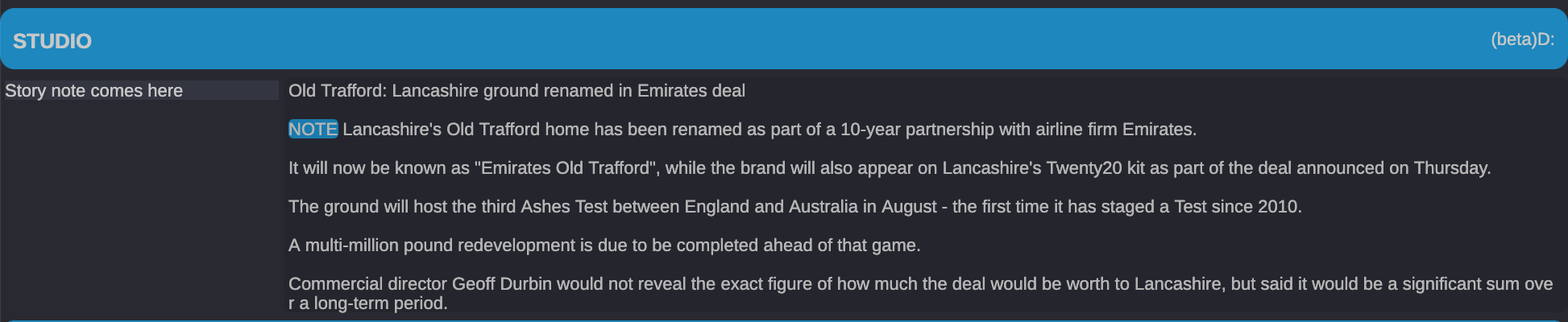
Editing Story Notes
Story notes can also be displayed and edited, however in the current version is not possible to create new notes from the Cloud UX application.
Working with Story Elements
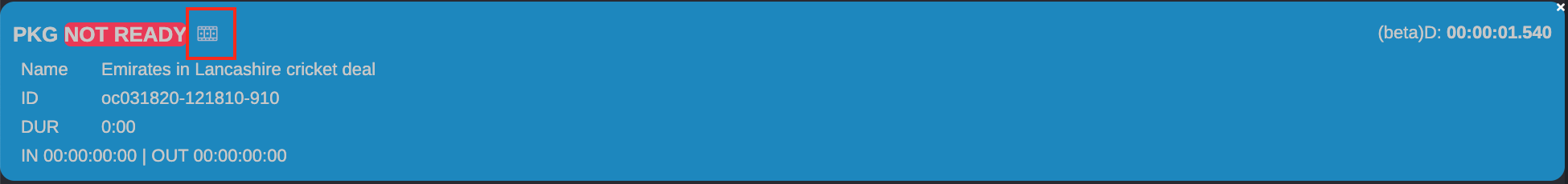
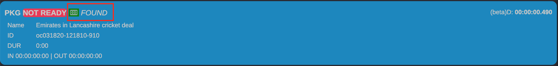
Story elements' behaviour and labels are defined by Octopus system administrators. If story element contains a clip, then clip details (status, name, id, duration) are displayed.
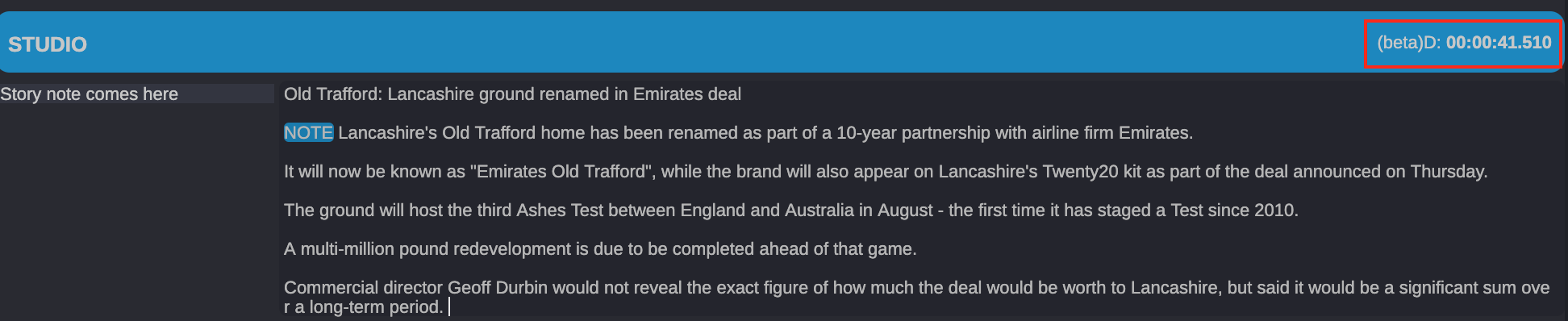
Story Element Counted Duration
The counted duration of the story element is displayed in the upper right corner of the element and is updated in real time while typing. This feature is available currently in BETA testing mode. If the counted duration in the Cloud UX is not matching with the counted duration in the regular Octopus app, please contact system administrators.
Story Element Clip
Each story element can contain clip. In case that story element already contains a clip, then the Octopus app inside Cloud UX is able to automatically find and open the clip in the Cloud UX Media Player if the clip exists or it can create and open a new clip for the placeholder. If the story element does not have a clip, then the Octopus app can create and assign a clip to the story element with a new unique ID.
These actions can be triggered by clicking the sequence button in the story element.
Following order of rules apply when clicking the sequence button:
- If the story element has no clip, then a new clip with new unique ID will be created and added to the story element. The new clip will be automatically opened in the Cloud UX Media Player and Timeline.
- If the story element already contains clip and its MOS status is READY, then the Octopus app will search for the clip ID in the /Sent to Playback Avid folder.
If it finds a clip, then it will be automatically opened in the Cloud UX Media Player and Timeline. If multiple clips with the given ID were found, then the clip with the latest modification time will be opened. - If the story element already contains clip and its MOS status is NOT READY, then the Octopus app will search for the clip ID in the /Projects Avid folder.
If it finds a clip, then it will be automatically opened in the Cloud UX Media Player and Timeline. If multiple clips with the given ID were found, then the clip with the latest modification time will be opened. - If the story element already contains clip but its ID was not found in previous steps, then a new clip with the given ID will be created and opened.
Assigning Existing Avid Asset to Story Element Clip
If users want to assign existing Avid asset to story element, they can drag and drop the asset from any Cloud UX app (Browse, Search, MediaPlayer, etc.) to a story element. If the used asset does not have a Video ID, then the drag and drop operation will create a new unique id for the asset and set that id for the story element's clip. If the story element already contains a clip, then the user has to confirm, that he wants to override the clip.
Removing Clip from Story Element
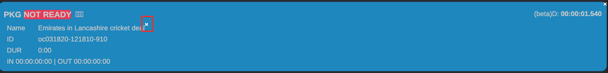
To remove clip from story element, users need to hover over the story element clip details and in the upper right corner click the x button and subsequently confirm the action in the popup message.
Removing Story Element
To remove story element, users need to hover over the story element and in the upper right corner click the x button and subsequently confirm the action in the popup message.
Story Folders
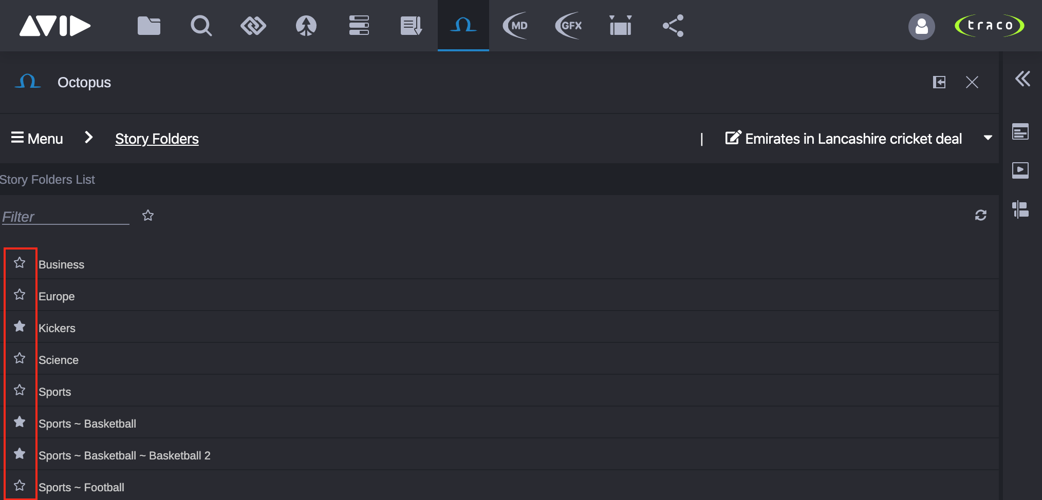
Clicking the Story Folders button in the Menu will open the Story Folders List.
Toolbar
In the toolbar the users can apply filters and customize the Story Folders view.
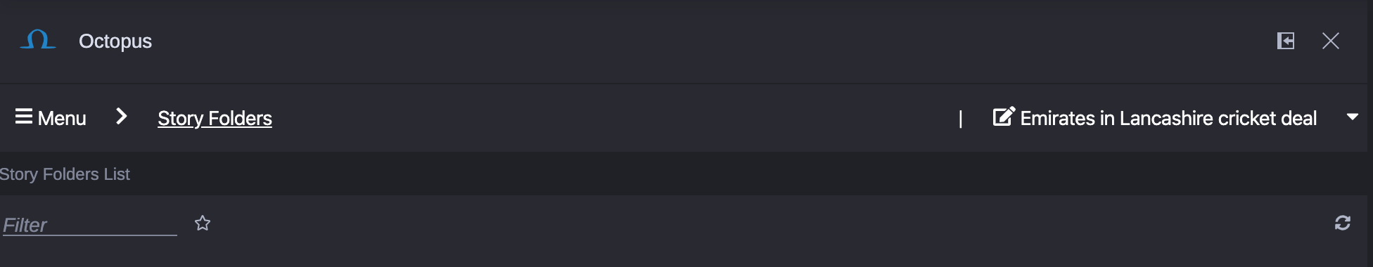
- Filter: Simple text filter.
 : If activated, only favorite story folders are shown. If not activated, all the story folders are shown.
On the right side of the toolbar a refresh button is located for manually refreshing the story folders, because the list is not updating automatically.
Add/Remove Story Folder to/from Favorites
Each story folder can be added/removed to/from favorites. Every user can have their own favorites which are saved automatically.
Open Story Folder
Clicking a story folder from the list will open the story folder and switch the view to display the stories in the story folder.
Story Folder's Stories
As the number of stories in story folders is not limited, loading the content of the story folder can take a long time (up to 2-4 mins if more than 1000 stories are in a story folder). The recommended way of working with story folders, is to frequently make sub folders to ensure opening the story folders as fast as possible.
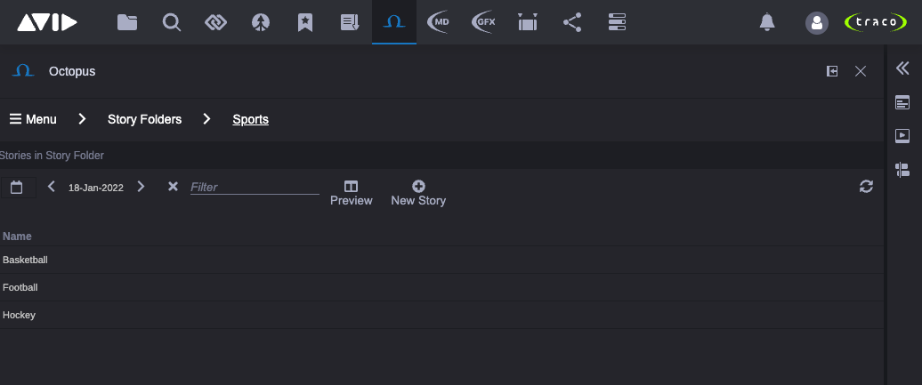
Toolbar
By default a time filter is applied to the stories in a story folder based on stories' scheduled date. This time filter can be changed or even deactivated from the toolbar.
- Filter: Simple text filter.
- Preview: Enable/Disable story folder preview mode (if enabled, then the opened story editor will be displayed right next to the stories list).
- New Story: Creating a new story in the opened story folder based on existing story templates.
On the right side of the toolbar a refresh button is located for manually refreshing the story folder's stories, because the list is not updating automatically.
Octopus App in Embedded mode (Media Composer, Adobe Premiere Pro)
The Cloud UX | Octopus app is by default accessible in embedded mode, so it can be loaded to companion windows in MediaCentral | Cloud UX integrations, such as Media Composer, Adobe Premiere Pro, etc.
Functionality in embedded mode is similar to regular Cloud UX window. The main benefit of the Cloud UX | Octopus app in embedded mode is a feature to work with story elements' clips, like adding them to Media Composer's Bins.
Adding Octopus Clip to Media Composer's Bin
When users open the Cloud UX | Octopus app in Media Composer window and clicks the sequence button for the selected clip, then Cloud UX prepares (creates or loads) the story element's clip. See order of rules when opening clip.
After the clip has been found or created, the sequence button turns green and a message appears for the user, signalizing the sequence can be added to Media Composer's opened Bin by drag and dropping the green sequence button from the story element's clip directly to the bin.
Integration with Traco GFX
Details about the integration with Traco GFX (including Viz Pilot) can be found in Traco GFX Documentation.
Integration with Other Systems
The Cloud UX | Octopus app can be used also with other systems supporting the MOS HTML5 based by drag and drop operation. Users can drag and drop HTML5 MOS objects to the story editor's text to create a MOS object with or without timing in the story.